Ecommerce data visualization means pairing each metric with the chart built to show it: a funnel chart for cart drop-off, a bar chart for product comparison, a line chart for revenue over time, and a cohort table for repeat-purchase behavior. This guide maps every core ecommerce metric to its chart, backed by usage data from 3,339 real CleanChart sessions.
Updated October 1, 2026: refreshed the usage data; September 12, 2026: added a data section with real CleanChart usage stats and a full upload-to-chart walkthrough.
Say your store generated 847,392 page views last month. 23,847 visitors added products to cart. But only 3,291 actually purchased. Revenue hit $287,450, down 12% from projections.
Where did the other 20,556 carts go? Which products underperform? Is your marketing spend returning value? Are customers coming back?
The answers hide in your data. Google Analytics, Shopify reports, payment processor data, CRM records—terabytes of information. But spreadsheets and raw data don't reveal patterns. They don't show you where revenue leaks occur or which opportunities to seize.
E-commerce data visualization transforms these numbers into actionable insights.
A well-designed conversion funnel chart instantly shows your biggest drop-off point—checkout page abandoning 67% of carts, screaming for optimization. A product performance heatmap reveals that 80% of revenue comes from just 15% of SKUs. A customer cohort retention chart shows first-time buyers rarely return without email nurturing.
In e-commerce, margins are thin, competition is fierce, and customer attention is fleeting. Data-driven decisions separate thriving stores from struggling ones. Visualization enables those decisions by making patterns visible, opportunities obvious, and problems unmissable.
This comprehensive guide covers everything you need to master e-commerce data visualization:
- Critical metrics every store must track and visualize
- Conversion funnel optimization through visual analysis
- Product portfolio performance visualization
- Revenue trend analysis and forecasting charts
- Customer behavior patterns and lifetime value tracking
- Marketing ROI and attribution visualization
Whether you're a Shopify store owner analyzing your first thousand sales, a marketing manager optimizing ad spend, or an e-commerce director reporting to executives, these visualization techniques will sharpen your competitive edge.
What Ecommerce Teams Actually Chart in CleanChart
Rather than guess which chart types and file formats ecommerce teams reach for, here's what 3,339 real CleanChart sessions show.
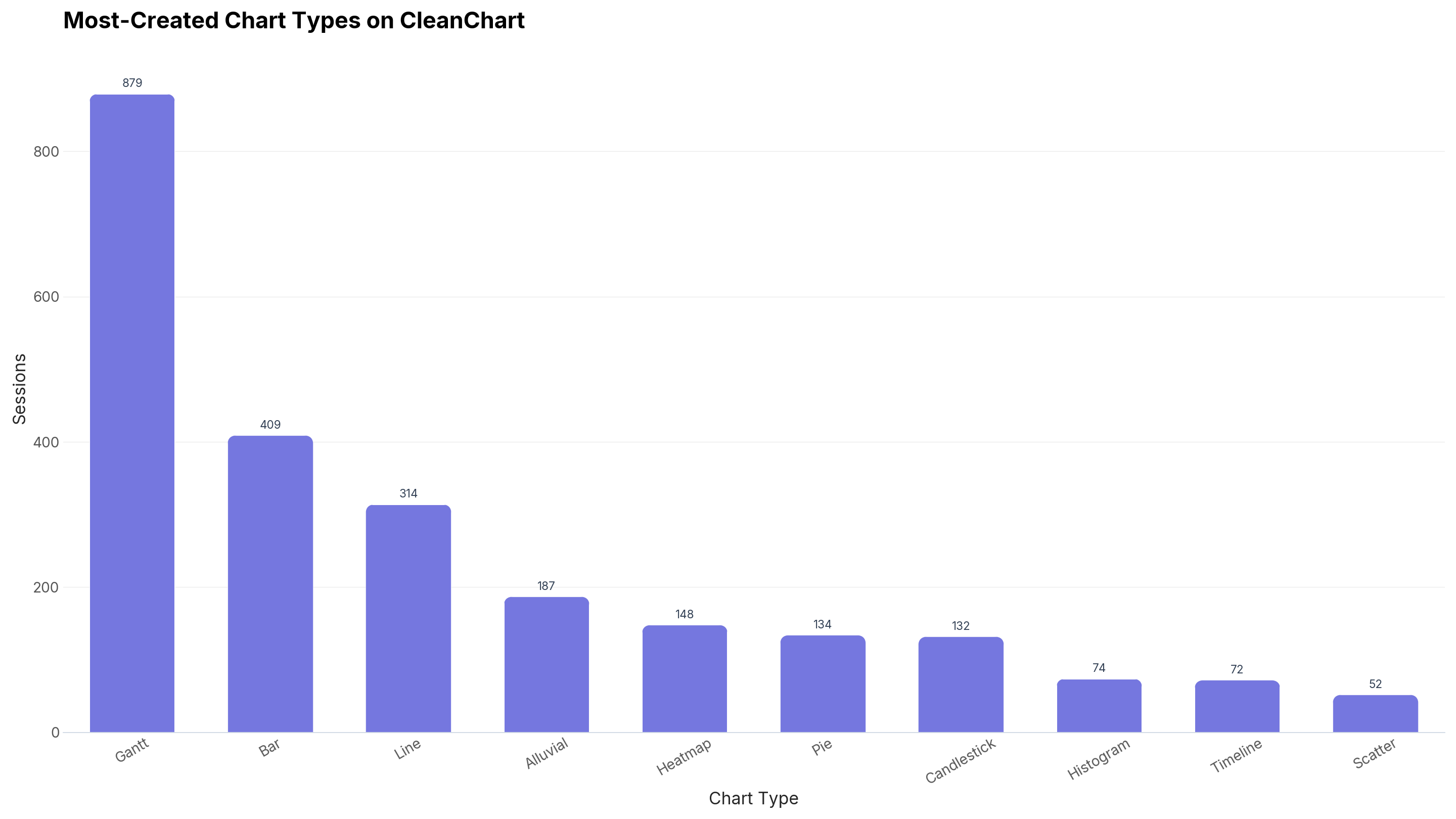
The practical implication: if you're choosing a default chart for a new ecommerce dashboard tile and don't have a strong reason otherwise, bar or line is the safer starting point than a funnel or gauge chart, simply because that's what most teams settle on once they see the data.
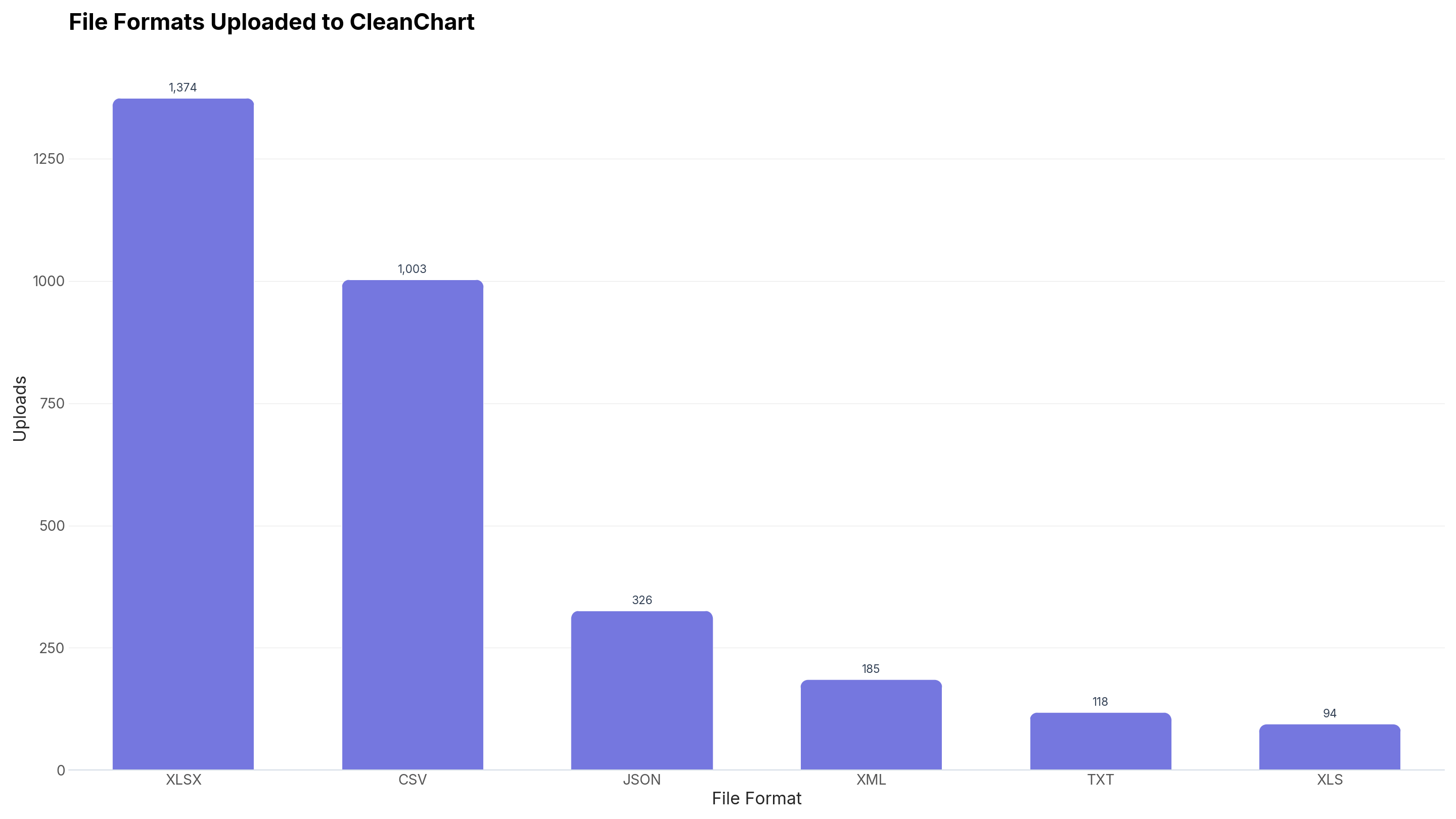
TODO(data): "ecommerce" is now a published-size dataset archetype in CleanChart's classifier (n = 74 sessions), but we haven't broken out ecommerce-specific chart-type or cleaning-issue counts yet. We'll add that breakdown here in a future refresh.
Why E-commerce Visualization Drives Revenue
Speed of Decision-Making
E-commerce moves fast. Trends shift weekly. Competitors launch campaigns overnight. Customer preferences evolve continuously. Waiting for monthly reports means missing opportunities.
Example scenario: Friday evening, you notice cart abandonment spiking on mobile. Spreadsheet analysis would take hours. But a real-time conversion funnel dashboard shows instantly: new checkout button placement is confusing mobile users. You revert the change. By Saturday morning, conversions normalize. Without visualization, you'd have lost a weekend of sales diagnosing the problem.
Visualization compresses analysis time from hours to seconds.
Pattern Recognition at Scale
Human brains excel at visual pattern recognition. We spot trends, outliers, and correlations in images faster than in numbers.
Revenue seasonality:
- Spreadsheet: 365 rows of daily revenue numbers
- Visualization: Line chart with clear peaks (Black Friday, holidays) and valleys (post-holiday slump)
The seasonal pattern jumps out visually. In spreadsheets, it requires careful analysis.
Product category performance:
- Spreadsheet: 500 SKUs with sales, returns, margins
- Visualization: Bubble chart showing category clusters by volume, profitability, growth
Instantly see: Electronics sells volume but low margin. Home goods higher margin but slow-moving. Optimization strategies become obvious.
Stakeholder Communication
E-commerce businesses involve diverse stakeholders: founders want growth metrics, investors seek unit economics, marketing needs campaign performance, operations requires inventory insights, customer service tracks satisfaction.
One well-designed dashboard serves all audiences. Visual hierarchy guides attention. Interactive filtering enables exploration. Consistent metrics prevent confusion.
Board meeting transformation: "Sales are up 15%" becomes a revenue trend chart showing sustainable growth trajectory, seasonality patterns, and projections—far more compelling and trustworthy.
Identifying Optimization Opportunities
Every e-commerce business has leaky buckets. Traffic arriving but not converting. Customers buying once but not returning. Products selling but losing money after returns.
Visualization makes these leaks visible:
- Funnel charts show exactly where customers drop off
- Cohort analysis reveals retention problems
- Profitability heatmaps identify money-losing products
- Customer journey maps expose friction points
Once visible, problems become solvable. Hidden problems persist indefinitely.
Competitive Advantage
According to McKinsey research, data-driven organizations are 23 times more likely to acquire customers. In e-commerce specifically, stores using advanced analytics grow revenue 2–3x faster than competitors relying on intuition.
Visualization isn't just about understanding your data—it's about understanding it faster and better than competitors. While they analyze last month's spreadsheets, you're optimizing this week's campaigns based on real-time visual insights.
Essential E-commerce Metrics to Visualize
Acquisition Metrics
Traffic by Source — Where visitors originate: organic search, paid ads, social media, email, direct, referral. Pie charts or stacked area charts show composition and trends.
Cost Per Acquisition (CPA) — Marketing spend divided by new customers. Track by channel to identify efficient acquisition sources. Bar charts compare channel effectiveness.
Click-Through Rates (CTR) — Ad or email engagement percentage. Line charts show CTR trends over campaigns. Identify fatigue or improving creative.
Bounce Rate — Visitors leaving immediately. High bounce rate signals relevance problems. Visualize by landing page or traffic source.
Conversion Metrics
Conversion Rate — Purchases divided by visitors. The ultimate e-commerce metric. Track overall and by segment (device, source, location).
Add-to-Cart Rate — Interest indicator before purchase commitment. Compare to conversion rate—gap shows checkout friction.
Cart Abandonment Rate — Carts created but not purchased. Visualize abandonment stages to pinpoint dropout causes.
Checkout Completion Rate — Started checkouts that complete. Each step failure loses revenue.
Revenue Metrics
Gross Merchandise Value (GMV) — Total transaction value. Headline revenue metric. Line charts show growth trajectory.
Average Order Value (AOV) — Revenue per order. Segmented analysis reveals opportunities—mobile AOV lower than desktop? Free shipping threshold optimization potential.
Revenue Per Visitor (RPV) — Combines conversion rate and AOV. Holistic efficiency metric. Compare across traffic sources.
Net Revenue (After Returns) — True revenue after subtracting returns and refunds. Critical profitability indicator.
Customer Metrics
Customer Lifetime Value (CLV) — Total revenue expected from customer relationship. Most important long-term metric.
Repeat Purchase Rate — Percentage of customers returning. Health of customer relationships.
Customer Acquisition Cost (CAC) — Total cost to acquire one customer. Compare to CLV—must be sustainable ratio (typically CAC < CLV/3).
Net Promoter Score (NPS) — Customer satisfaction and loyalty indicator. Track trend over time.
Product Metrics
Units Sold by Product — Inventory velocity. Identify fast movers and slow movers.
Revenue Concentration — Which products drive what percentage of revenue. Pareto analysis critical.
Return Rate by Product — Quality or description issues. High return rates destroy profitability.
Inventory Turnover — How quickly inventory sells. Cash flow and storage cost implications.
Conversion Funnel Visualization
Understanding Your Conversion Funnel
The e-commerce conversion funnel represents customer journey stages:
- Awareness: Visitor arrives (Site visit)
- Interest: Visitor engages (Product page view)
- Desire: Visitor considers (Add to cart)
- Action: Visitor purchases (Checkout completion)
Each transition has a conversion rate. Each drop-off represents lost revenue.
Standard e-commerce funnel example:
- Site visits: 100,000
- Product page views: 45,000 (45% view products)
- Add to cart: 12,000 (26.7% of viewers add)
- Begin checkout: 8,000 (66.7% of carters checkout)
- Purchase: 4,000 (50% complete purchase)
- Overall conversion: 4%
Creating Effective Funnel Charts
Horizontal funnel visualization: Wide at top (many visitors), narrowing to bottom (few purchasers). Each stage labeled with absolute numbers and conversion percentages.
Vertical bar comparison: Sequential bars showing volume at each stage. Height differences emphasize drop-offs.
Sankey diagram: Flow visualization showing paths through the funnel. Branching reveals where customers go when they don't convert.
CleanChart approach: upload funnel stage data (Stage, Count), select a funnel chart, configure labels and colors, and instantly visualize drop-off points.
Identifying Funnel Bottlenecks
High bounce rate (awareness → interest): Landing page relevance problem. Are you attracting the wrong audience? Does the page load slowly? Is the value proposition unclear?
Low add-to-cart rate (interest → desire): Product presentation issues. Poor images? Missing information? Price too high? Trust concerns?
High cart abandonment (desire → action): Checkout friction. Unexpected shipping costs? Complicated checkout process? Security concerns? Limited payment options?
Low checkout completion: Technical or trust issues. Form errors? Payment failures? Guest checkout unavailable?
The biggest percentage drop deserves primary attention. In the example above, 50% checkout completion is the worst conversion point. Fix that first—doubling it would double overall revenue.
Segmented Funnel Analysis
Different customer segments have different funnel shapes:
- By device: Mobile often shows higher abandonment than desktop. Checkout optimization is critical for mobile.
- By traffic source: Paid traffic might have a lower product view rate (broader audience) but higher intent once engaged.
- By customer type: New visitors convert differently than returning customers.
- By geography: International customers may abandon at the shipping stage more frequently.
Visualize multiple funnels side-by-side or overlaid to immediately spot which segments underperform.
Funnel Optimization Tracking
Before/after visualization: Show funnel improvements over time. Did a checkout redesign improve completion rate?
A/B test funnel comparison: Control versus variant funnels. Which version converts better at each stage?
Weekly funnel trends: Track stage conversion rates weekly. Detect degradation before revenue impact compounds.
Product Performance Analytics
Revenue Concentration Analysis
The Pareto principle often holds in e-commerce: 20% of products generate 80% of revenue. Visualization reveals this concentration instantly.
Pareto chart construction:
- X-axis: Products ranked by revenue (highest to lowest)
- Left Y-axis: Individual product revenue (bars)
- Right Y-axis: Cumulative percentage (line)
Use a treemap as an alternative—each product as a rectangle sized by revenue, colored by profitability, for an instant portfolio view. Insights: which products are "stars"? Are you over-investing in the long tail?
Product Profitability Matrix
Plot products on a scatter chart with units sold on the X-axis and profit margin percentage on the Y-axis:
- Stars: High volume + high margin (protect and expand)
- Cash cows: High volume + low margin (optimize margins)
- Question marks: Low volume + high margin (marketing opportunity)
- Dogs: Low volume + low margin (consider discontinuing)
Size each dot by total profit contribution for a complete picture.
Category Performance Trends
Track revenue trends for each product category over time using line charts. Questions answered: which categories grow, which decline, are there seasonal patterns by category, what is the impact of new product launches? Stacked area charts show category composition of total revenue—see shifts in product mix over time.
Inventory Health Visualization
A stock turn heatmap (products versus time periods, color intensity showing days of inventory remaining) surfaces out-of-stock risks (revenue loss), overstock situations (cash tied up), and seasonal inventory needs.
Return Rate Analysis
Bar charts by product reveal return rates indicating quality or description issues: product defects, misleading photos, unclear size information, shipping damage. Visualize revenue versus net revenue after returns—a significant gap signals profitability problems.
Cross-Sell and Bundle Performance
A network graph—nodes as products, edges connecting frequently co-purchased items, edge thickness showing correlation strength—reveals natural bundle pairings and cross-sell opportunities.
Revenue and Sales Trend Charts
Daily/Weekly Revenue Tracking
Essential line chart setup: X-axis for date, Y-axis for revenue, multiple series for this year, last year, and target. Add a 7-day or 30-day moving average to smooth noise and reveal the underlying trend. Key patterns to identify: day-of-week effects, seasonal trends, promotion impacts, and anomalies requiring investigation.
Year-over-Year Comparison
YoY growth eliminates seasonality: YoY Growth = (This Year − Last Year) / Last Year × 100%. Use dual-axis line charts for absolute values, bar charts for growth percentages, or waterfall charts to explain growth drivers. Always combine with sequential (month-over-month) views—YoY alone hides recent changes.
Revenue Decomposition
A waterfall chart (Starting revenue → Contributing factors → Ending revenue) breaks down growth components: new customer revenue (+), returning customer revenue (+), increased AOV impact (+), lost customers (−), decreased frequency (−). Strategic insight: growth from new customers (marketing working) versus existing customers (retention strong).
Cohort Revenue Analysis
Group customers by acquisition month and track revenue over their lifecycle using a heatmap (rows: cohorts, columns: months since acquisition, color: revenue per customer). Key insights: do newer cohorts spend more? When does cohort revenue peak? Are long-term value trends improving?
Forecasting Visualization
Extend historical data with projections: a solid line for actuals, a dashed line for forecast, shaded bands for confidence intervals, and seasonality adjustments. Revenue forecasts guide inventory purchasing, staffing decisions, and cash flow management.
Channel Revenue Attribution
A stacked area chart showing channel contribution over time reveals over-reliance on a single channel, sustainability of paid traffic percentage, and organic growth trends. Channels to track: organic search, paid search, social media, email marketing, direct traffic, affiliate partnerships.
Customer Behavior Visualization
Customer Segmentation Charts
RFM (Recency, Frequency, Monetary) analysis via a scatter plot identifies:
- Champions: Recent, frequent, high spenders
- Loyal customers: Frequent buyers
- At-risk: Haven't purchased recently
- Lost: Long-absent former customers
Different marketing strategies per segment. Visualization guides resource allocation.
Purchase Frequency Distribution
A histogram (X-axis: number of purchases per customer, Y-axis: customer count) typically shows a heavy right skew—many one-time buyers, few repeat customers. Key metric: if 80%+ are one-time buyers, a retention problem exists.
Time Between Purchases
A histogram or box plot showing purchase gap distribution helps time email marketing—send reactivation emails before the typical repurchase window closes.
Customer Lifetime Value Distribution
Box plots by segment compare CLV distributions across customer types. High-value customer identification: the top 10% CLV customers deserve special treatment. Acquisition source comparison: do referral customers have higher CLV than paid acquisition? Adjust marketing spend accordingly.
Journey Path Analysis
A Sankey diagram maps customer flow through touchpoints: First visit → Return visit → Browse → Wishlist → Cart → Purchase → Review → Referral. Drop-off identification shows exactly where to intervene in the customer journey.
Session Behavior Visualization
Page flow analysis reveals which pages visitors see and in what sequence. Exit page identification shows where visitors leave—confusing pages or missing information. Session duration distribution: short sessions may indicate irrelevant traffic or poor engagement.
Geographic Customer Distribution
Choropleth maps show customer density or revenue by region, surfacing expansion opportunities and localization priorities for high-revenue regions.
Marketing Attribution Charts
Channel Performance Comparison
Grouped bar charts compare channels across key metrics: traffic volume, conversion rate, customer acquisition cost, customer lifetime value, and ROI percentage. Decision support: which channels deliver best returns? Where to increase or decrease spending?
Multi-Touch Attribution Visualization
No single attribution model is "correct"—each tells a different story:
- First-touch: First interaction gets 100% credit
- Last-touch: Final interaction before purchase gets credit
- Linear: Equal credit to all touchpoints
- Time-decay: Recent touches get more credit
- Position-based: First and last get 40%, middle splits 20%
A bar chart comparing revenue attribution under each model reveals sensitivity and prevents over-crediting single touchpoints.
Campaign Performance Timeline
Track campaign launch dates with performance metrics over time: impressions, clicks, conversions, revenue generated, and ROAS (Return on Ad Spend). Performance typically peaks then decays—visualize to time campaign refreshes optimally.
Email Marketing Analytics
Email campaign funnel: Emails sent → Emails delivered → Emails opened → Links clicked → Conversions. Track open rate trends, click-through rate evolution, and unsubscribe rate monitoring. Segmentation comparison: which customer segments respond best to email?
Social Media ROI Visualization
Platform comparison (Instagram, Facebook, TikTok, Pinterest) across engagement rates, traffic generated, conversion rates, average order value, and customer acquisition cost. Content type analysis: video vs. image vs. carousel performance.
Paid Advertising Analytics
Cost-efficiency visualization: cost per click trends, conversion rate by keyword, quality score tracking, budget utilization. Campaign budget optimization: visualize which campaigns deliver returns and reallocate budget accordingly.
Affiliate and Referral Tracking
Rank partners by performance across traffic driven, conversion rates, revenue generated, commission paid, and net ROI. Identify top affiliates for deeper partnerships.
Creating E-commerce Dashboards with CleanChart
Step 1: Define Dashboard Objectives
Answer key questions: Who views this dashboard? What decisions does it support? How often is it reviewed? What story should it tell?
Dashboard types:
- Executive summary: High-level KPIs, trends, goals
- Marketing performance: Campaign metrics, channel comparison, attribution
- Operations dashboard: Inventory, fulfillment, customer service
- Product analytics: SKU performance, category analysis, profitability
Step 2: Gather E-commerce Data
Common data sources: Google Analytics (traffic, behavior), Shopify/WooCommerce (transactions, products), payment processors (revenue, refunds), email platform (campaign performance), advertising platforms (ad spend, impressions), CRM (customer data, segments).
Export as clean CSV with consistent date formats (YYYY-MM-DD), numeric formats (no currency symbols), consistent category naming, and complete records. Example:
Date,Revenue,Orders,Visitors,Channel
2024-01-01,15240.50,187,4521,Organic
2024-01-01,8920.00,98,2103,Paid
2024-01-02,12480.75,152,4287,Organic
Step 3: Create Individual Visualizations
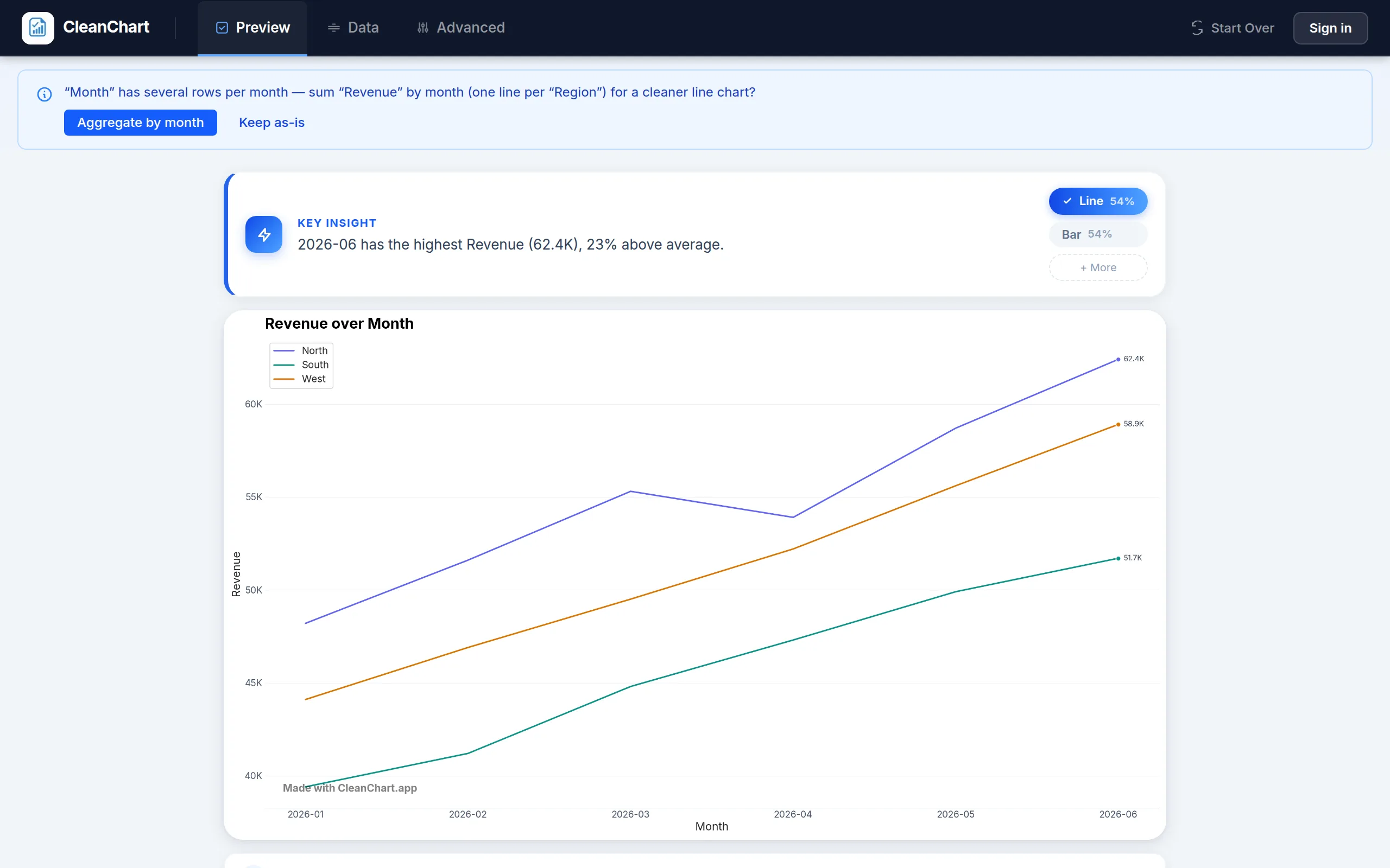
For each metric: upload relevant data to CleanChart, select the appropriate chart type (revenue trends → line chart, channel comparison → bar chart, conversion funnel → funnel chart, product profitability → scatter plot, category composition → treemap), configure with consistent colors and clear labels, then export as PNG for static reports or interactive HTML for web dashboards.
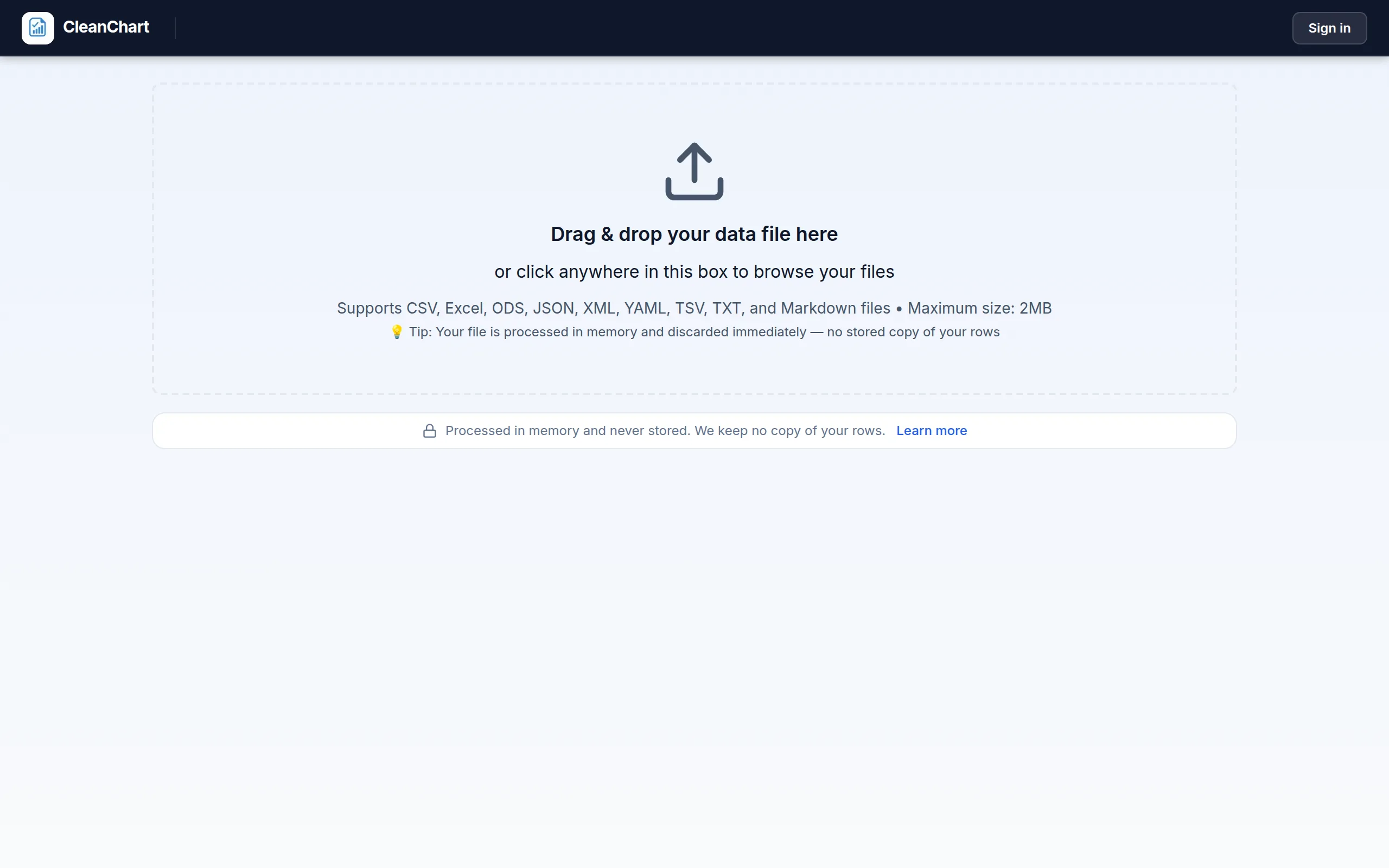
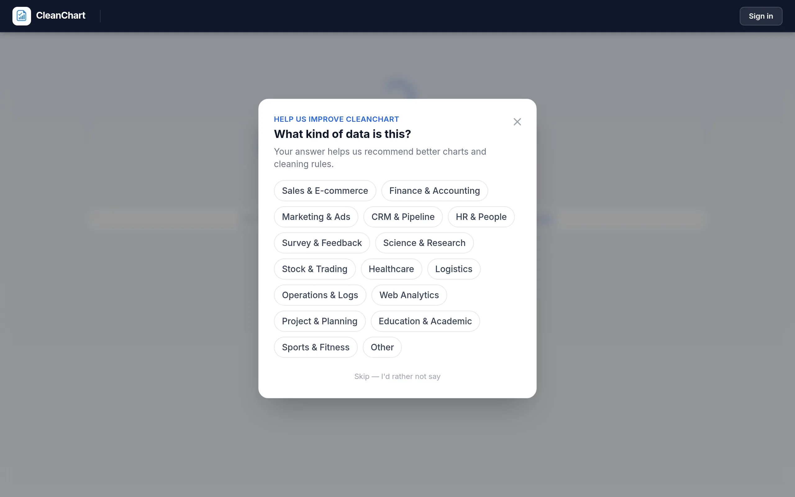
Here's the actual flow with a CSV export of daily revenue and orders:
Step 4: Design Dashboard Layout
Layout principles: most critical metrics top-left (first viewed), related visualizations grouped, logical flow from overview to details, consistent spacing, and white space for readability. Example executive dashboard:
[Revenue Trend]     [Conversion Rate]    [AOV]
[Traffic Sources]   [Conversion Funnel]
[Top Products]      [Customer Segments]
Step 5: Add Interactive Features
CleanChart capabilities: date range selectors, category filters, hover tooltips with details, click-to-drill-down, and export options. Interactivity enables progressive disclosure—executives see an overview, click to examine specific time periods, filter to a single channel.
Step 6: Establish Update Cadence
Automate where possible: scheduled data exports, regular CleanChart data refresh, alert thresholds for anomalies. Manual review schedule: daily quick glance, weekly detailed analysis, monthly strategic review. Start simple—add visualizations as needs emerge, remove unused elements.
Best Practices for E-commerce Analytics
Focus on Actionable Metrics
Every chart should answer: "Based on this, what action should we take?" Prefer actionable metrics over vanity metrics:
- Vanity: Total page views → Actionable: Conversion rate by product page
- Vanity: Total registered users → Actionable: Active customers in last 90 days
- Vanity: Social media followers → Actionable: Social media conversion rate
Compare Appropriate Benchmarks
"3% conversion rate" means nothing alone. "3% conversion rate, up from 2.1% last year, approaching industry benchmark of 3.5%" tells a complete story. Include benchmark lines or comparison series in charts. Types of benchmarks: historical, goal-based, industry standard, cohort comparison.
Segment Everything
Aggregated data hides insights. An overall conversion of 2.5% might break down as desktop 3.8%, mobile 1.9%, tablet 2.4%—revealing a clear mobile optimization opportunity. Always segment by device type, traffic source, customer type (new/returning), geographic location, and time of day.
Track Leading and Lagging Indicators
Lagging indicators are results (revenue, profit, conversion rate). Leading indicators are predictors (traffic, email signups, social engagement). Balance your dashboard: email list growth (leading) predicts future revenue from email campaigns (lagging). Declining leading indicators are early warnings to investigate before revenue is impacted.
Maintain Data Quality
Common e-commerce data issues: missing transactions (tracking gaps), duplicate orders, currency inconsistencies, timezone mismatches, bot traffic inflation. Chart anomalies often indicate data issues, not business changes—investigate spikes and drops. Cross-reference payment processor data with analytics and reconcile regularly.
Tell Stories, Not Just Show Numbers
A bad visualization shows "conversion rate is 2.8%." A good visualization shows "conversion rate improved from 2.1% to 2.8% after checkout redesign"—with an annotation marking the implementation date and the calculated revenue impact. Every chart needs: what changed, why it changed, what it means, and what action follows.
Avoid Common Pitfalls
Overcrowded dashboards create confusion—prioritize ruthlessly. Inconsistent metric definitions across reports cause confusion—standardize calculations. A holiday spike doesn't mean marketing worked—account for external factors. Don't over-visualize at the expense of action.
Frequently Asked Questions
What's the most important e-commerce metric to visualize first?
Conversion rate, visualized as a funnel showing drop-off at each stage. It's the master metric—traffic without conversion wastes money, products without sales waste inventory. Start with the overall conversion rate trend (is it improving?), then segment by device, traffic source, and customer type. Funnel visualization immediately reveals your biggest revenue leak. If 70% abandon at checkout, that's your optimization priority. If few visitors add to cart, product pages need work. This single visualization guides where to focus limited optimization resources for maximum revenue impact.
How often should I update my e-commerce dashboards?
It depends on metric volatility and decision frequency. Revenue and conversion metrics: daily updates (spot problems quickly). Marketing campaign metrics: real-time or daily during active campaigns. Customer lifetime value: monthly (needs accumulation time). Product profitability: weekly or bi-weekly. Inventory metrics: daily for fast-moving items. Automate updates where possible—manual updating wastes time and introduces errors. Most e-commerce teams benefit from a daily quick glance, weekly detailed analysis sessions, and monthly strategic reviews with leadership.
How do I visualize multi-touch attribution effectively?
Start with a comparison visualization showing the same revenue attributed under different models (first-touch, last-touch, linear, time-decay, position-based). A bar chart comparing channel revenue under each model reveals attribution sensitivity. No single model is "correct"—each tells a different story. First-touch emphasizes awareness channels (content marketing, social media). Last-touch favors closing channels (retargeting, email). Visualize customer journey paths with Sankey diagrams showing typical touchpoint sequences. Ultimately, test: if you reduce spending on a channel, does revenue drop as predicted by your attribution model?
What visualizations help reduce cart abandonment?
Three critical visualizations: (1) Checkout funnel micro-steps—break checkout into individual steps (shipping info, payment entry, review, confirm) and visualize abandonment at each micro-step to identify specific friction. (2) Abandonment timing—when do users abandon? Immediately upon seeing shipping cost? After entering payment? (3) Abandonment by segment—compare mobile vs. desktop, new vs. returning customers, and traffic source. Combine with exit survey data showing stated abandonment reasons. Once you see exactly where and why abandonment happens, interventions become obvious: unexpected shipping costs → show cost earlier; payment security concerns → add trust badges at checkout.
How do I create executive-level e-commerce dashboards?
Executives need strategic overview, not operational details. Include: (1) Revenue trend with year-over-year comparison and forecast. (2) Key conversion metric (simple percentage with trend arrow). (3) Customer acquisition cost and lifetime value ratio. (4) Top 3–5 KPIs with goal attainment indicators. Avoid granular product data, daily fluctuations, and technical metrics (bounce rate, page load time). Maximum 6–8 visualizations on a single view. Large, readable numbers. Color coding for good/bad/neutral. Every element should answer: "How is business performing against goals?"
What's the best way to visualize product performance across hundreds of SKUs?
Avoid listing all SKUs—cognitive overload results. Instead: (1) Pareto chart showing cumulative revenue contribution (reveals that 20% of SKUs drive 80% of revenue). (2) Treemap with rectangle size representing revenue, color representing profitability or growth rate. (3) Profitability quadrant scatter plot (volume vs. margin). (4) Category-level aggregation with drill-down capability. Focus visualization on actionable questions: which products to expand, which to discontinue, which need markdown? Summary visualizations with exception reporting (showing outliers requiring attention) are more useful than comprehensive SKU lists.
How do I track and visualize customer lifetime value effectively?
CLV requires time—customers need lifecycle history. Approach: (1) Historical CLV distribution—histogram showing value spread, identifying high-value customer characteristics. (2) Cohort-based CLV tracking—track revenue from customer cohorts (by acquisition month) over time using a heatmap with months since acquisition. (3) Predictive CLV visualization—model expected future value based on early behavior, visualize predictions with confidence intervals. (4) CLV by acquisition source—compare which channels acquire the highest-value customers. (5) CLV vs. CAC ratio tracking—visualize this critical ratio over time to ensure sustainable unit economics.
Should I visualize real-time or aggregated e-commerce data?
Both, for different purposes. Real-time is valuable for detecting sudden problems (site down, payment processor failing), monitoring active campaigns (product launch, flash sale), holiday/peak period tracking, and A/B test monitoring. Aggregated data is valuable for identifying trends (daily noise smoothed), strategic decisions, reporting, and forecasting. The balanced approach: real-time alerts for anomalies (sudden drops beyond a threshold), aggregated analysis for strategic insights. Most e-commerce operations benefit from real-time operational monitoring plus aggregated strategic analysis.
How do I visualize the impact of pricing changes on sales?
Price elasticity visualization shows the relationship between price changes and demand. Approach: (1) Before/after analysis—time series with price change marked, showing sales volume and revenue impact. (2) Price-volume scatter plot—multiple data points showing price levels and corresponding sales volumes. Fit a demand curve. (3) Revenue optimization curve—visualize revenue at different price points to find the optimal price. (4) Segment-specific elasticity—different customer segments respond differently to pricing. (5) Margin impact—show profit changes, not just revenue. Lower price might increase volume but decrease profit. Caveat: correlation isn't causation. Other factors (seasonality, marketing, competition) affect sales simultaneously.
What tools integrate best with e-commerce platforms for visualization?
Integration options vary by platform and technical resources. Native tools: Shopify Analytics (basic, included), Google Analytics (free, powerful, requires setup). Third-party connectors like Zapier and Segment connect platforms to visualization tools. Dedicated e-commerce BI tools such as Glew.io, Metrilo, and TripleWhale specialize in e-commerce data aggregation. Lightweight option: CleanChart accepts CSV exports from any platform—no complex integrations needed, fast setup, ideal for teams without dedicated data engineers. Start simple (CSV exports to CleanChart), add complexity (automated pipelines) as needs and capabilities grow. Perfect shouldn't be the enemy of good—basic visualization now beats a perfect system never implemented.
Related CleanChart Resources
- Data Visualization for Beginners: Complete Guide
- Marketing Data Visualization: Track Campaign Performance
- Visualize E-commerce KPIs: Revenue, Conversion and More
- Financial Data Visualization: Charts for Finance
- Business Reports with Charts: Drive Decision Making
- Sales Chart Guide: How to Visualize Sales Data
- Funnel Chart Maker